Machine Learning & Signals Learning
C Plotting
This appendix collects how figures should be prepared: which visual channels a reader can actually decode, which ones only look informative, and which library defaults quietly damage the result. The rules are few, they are supported by measurement rather than taste, and at least some of them are violated by the first plot any tool produces.
"There are three kinds of lies: lies, damned lies, and statistics"
Various Attributions
C.1 Preface
C.2 A Chart That Cost a Space Vehicle
C.2.1 The Story
On the evening of 27 January 1986, engineers at Morton Thiokol recommended against launching the Space Shuttle Challenger the next morning. Their concern was the temperature: the rubber O-rings sealing the joints of the solid rocket boosters stiffen in the cold, and the forecast overnight low was far below anything the program had flown in. They had the flight history to support the concern. But they did not have was a chart that clearly showed it.
Fig. C.1 is one of the charts they presented. It carries the whole damage record: twenty-four booster pairs, the O-ring temperature (\({}^\circ \)F)of each, and every erosion and blow-by incident that had been found on recovery.
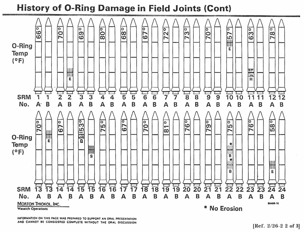
Read it against the rest of this appendix and it fails on nearly every count at once.:
-
• The forty-eight rocket outlines are decoration: they encode nothing, and they consume most of the page (Sec. C.11).
-
• Temperature, the quantity the entire argument turns on, is printed as rotated text inside each drawing rather than given a position on an axis, which is the one channel a reader decodes accurately (Sec. C.6).
-
• Damage is encoded as unexplained hatch patterns and the letters E, B and S.
-
• The flights are ordered by booster number, so the coldest launch on record sits in the middle of the second row with nothing to distinguish it. The relation between temperature and damage is present in this chart and cannot be read from it.
C.2.2 The same data on axes
Fig. C.2 plots the identical record. The horizontal axis is temperature, the vertical axis is the number of O-rings damaged on that launch, and nothing else is on the page.
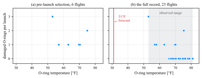
(a) The six damage flights that the pre-launch discussion centered on. Damage occurs from \(53\) to \(75\,^{\circ }\)F with no visible trend, which is the reading that was available on the night.
(b) The same record with the undamaged flights restored: all four launches at or below \(63\,^{\circ }\)F were damaged, while only \(3\) of the \(19\) warmer ones were. The vertical line marks the \(31\,^{\circ }\)F forecast for the launch morning and the shaded band the range ever flown. Tied points are spread horizontally by up to \(0.35\,^{\circ }\)F so that the four flights at \(70\,^{\circ }\)F can be counted. Data: orings from the R package DAAG, after the Presidential Commission report, Vol. 1, pp. 129–131.
The two panels differ only in which flights they contain. Panel (a) holds the flights that showed damage, which is roughly the selection the argument was built from: six points between \(53\) and \(75\,^{\circ }\)F, no pattern, and therefore no case. Panel (b) restores the seventeen launches that came back clean. Those seventeen are not absence of evidence; each one is a launch at a known temperature that produced no damage, and they are what turns a scatter of incidents into a relation. Every launch at or below \(63\,^{\circ }\)F was damaged. Only three of the nineteen above it were.
The vertical line is the forecast for the following morning, \(31\,^{\circ }\)F, which is \(22\,^{\circ }\)F colder than the coldest launch ever attempted.
What the case actually shows
The engineers were right, they had the data, and they presented it. The failure was in the encoding. A chart that places the causal variable on an axis takes about a minute to make from the same numbers, and it makes the argument by itself. That is the claim this appendix defends: plotting is a technical skill with a right and a wrong answer, not a matter of presentation polish applied after the analysis is finished.
C.3 Why Plot at All
Fig. C.3 shows four datasets constructed by Anscombe in 1973. All four have:
-
• mean \(9.00\) in \(x\)
-
• mean \(7.50\) in \(y\),
-
• variance \(10.00\) and \(3.75\) (use the \(1/n\) normalization used throughout this book),
-
• correlation \(0.816\), and
-
• least-squares fit \(\hat {y} = 3.00 + 0.50x\).
Every statistic this book has introduced for describing a bivariate relation is identical across the four panels, to two decimals.
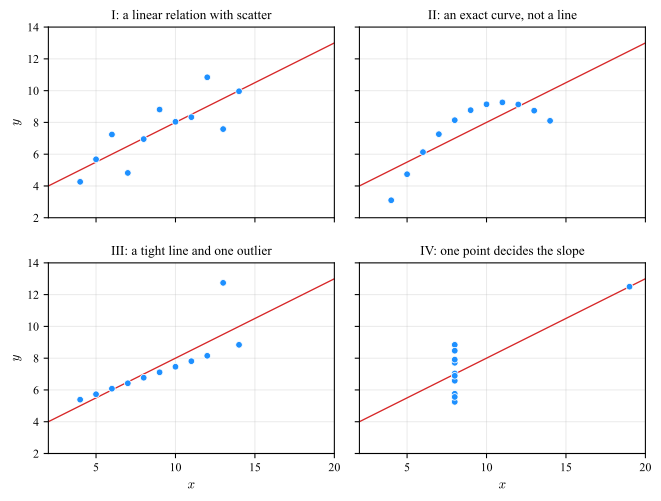
This is the reason the exploratory sections of this book lead with plots. The five-number summary behind a boxplot (Sec. 1.3) is a compression, and Sec. 1.5 exists precisely because a boxplot cannot show that a distribution has two modes. The same argument runs one level up: a statistic is a compression of a plot, and a plot is a compression of the data. Each step discards structure, and the discarded structure is where the modeling errors hide.
C.4 What the Eye Does for Free
Sight carries more information per second than the other senses combined, but it does not deliver that bandwidth uniformly. Table C.1 puts numbers on the first claim: the eyes alone move about \(10^{7}\) bit/s, and the five channels together deliver roughly \(11\) million bit/s to the brain. Conscious processing keeps up with only about \(50\) bit/s, so almost everything is discarded before it reaches awareness. A chart is a device for choosing what survives that reduction, and it is effective in proportion to how much of the reader’s throughput it spends on the data rather than on decoding the chart.
| Sensory system | Bits per second |
| Eyes | 10,000,000 |
| Skin | 1,000,000 |
| Ears | 100,000 |
| Smell | 100,000 |
| Taste | 1,000 |
Visual processing runs in two stages:
-
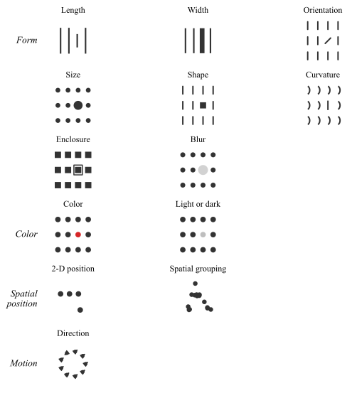
1. The first stage is pre-attentive: a small set of features is extracted from the entire visual field in parallel, in roughly the \(200\) ms between one eye movement and the next, without conscious effort and without regard to how many objects are present. The list is short and has been established experimentally: length, width, size, curvature, number, line ends, intersection, closure, color, how light or dark a mark is, flicker, direction of motion, and a few depth cues.
The second stage is serial. It identifies objects and their arrangement, it consults memory, and its cost grows with the number of items to be examined.
Fig. C.4 shows each of these channels in isolation: in every small grid one mark differs from the rest along a single feature, and the eye lands on it without a search.
The three demonstrations of Fig. C.5 show what the difference between the two stages feels like.
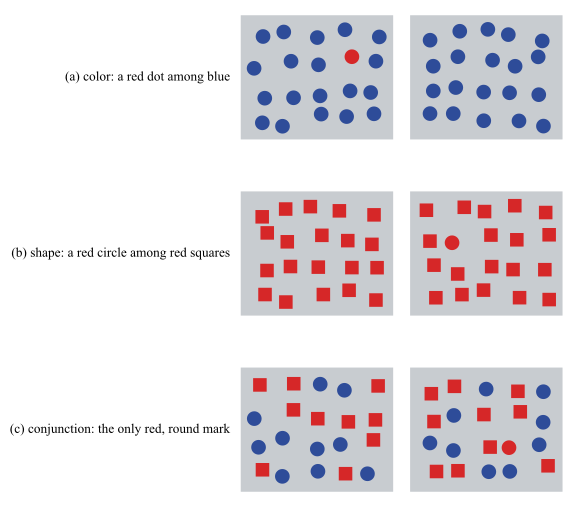
The practical consequence is the third row. A reader can be asked to find the red mark, or the round mark, and will find it instantly however many distractors there are. A reader asked to find the mark that is red and round has to inspect the marks one at a time, and the time taken grows with their number.
Encoding one variable in color and a second in marker shape, and then asking the reader to locate a particular combination. Two channels are fine for two independent readings, and they fail for a conjunction.
C.4.1 Two ways a graph is read
A reader arrives at a figure with one of two questions, and the two are served by different halves of the machinery above.
-
• Pattern perception asks what the shape is: which values are large, where the group boundaries fall, whether the decay is smooth. It rides the parallel stage, so it is free and it scales, and twenty marks are taken in as fast as five.
-
• Table look-up asks for one named item and its value.1 It is a search, so it runs in the serial stage, and its cost grows with the number of marks unless the order of the rows tells the reader where to stop.
Fig. C.6 draws one set of twenty numbers twice, changing nothing but that order.
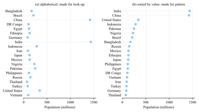
Neither panel answers both questions, and the one it answers is decided by the ordering rather than by the encoding, which is identical in the two. So the ordering is not a formatting detail. Most figures in a technical document are read for pattern, which is why sorting by value is the default (Sec. C.11).
1 The two operations are Cleveland’s, and the experiments that measured the encodings behind them are Cleveland and McGill, “Graphical Perception: Theory, Experimentation, and Application to the Development of Graphical Methods”, J. American Statistical Association, vol. 79, no. 387, 1984, pp. 531–554. That paper is what turned chart choice from taste into an experimental question: it isolates the elementary perceptual tasks a reader performs when decoding a graph, measures the accuracy of each on human subjects, and produces the ranking of Sec. C.6. The look-up and pattern example of Fig. C.6 follows Cleveland, The Elements of Graphing Data (1985; rev. 1994).
Figure\(\rightarrow \)Table
a figure that is genuinely consulted by name wants alphabetical order; and a figure that is only ever consulted by name wants to be a table.
C.5 Color
Color buys three no other channel offers at the same price:
-
• it calls attention to one mark among hundreds without enlarging it or moving it,
-
• it gives a figure something to be remembered by,
-
• it adds a dimension to a page that has only two.
Color is the easiest channel to misuse
Colors always produce a picture and the picture always looks like data.
C.5.1 Which part of a color can be ranked
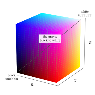
A color in a figure is three numbers: how much red, how much green and how much blue the screen mixes. Each runs from \(0\) to \(1\), or equivalently from \(0\) to \(255\), so every color a figure can use is a point in the box of Fig. C.7 — black at the origin where all three are \(0\), white at the opposite corner where all three are \(1\), and the grays on the diagonal between them, where the three are equal.
Hex codes
The same three numbers are almost always written as six hexadecimal digits, two per channel, running from 00 to FF: #000000 is black, #FFFFFF white, #FF0000 red, #808080 mid gray, and #1F77B4 is the blue matplotlib draws its first line in. Every plotting library, style file and web page accepts this form, and it is the form in which a palette should be recorded — a color called “blue” is a different color in every tool, while #1F77B4 is not.
Two colors written that way are two points in the cube, so how far apart they are is the straight line between them,
\(\seteqnumber{0}{}{0}\)\begin{equation} d = \sqrt {(R_1-R_2)^2 + (G_1-G_2)^2 + (B_1-B_2)^2} , \label {eq-plot-rgb-distance} \end{equation}
with \(d=0\) for one color written twice and, at the other extreme, \(d=\sqrt {3}\approx 1.73\) for black against white, the diagonal of the cube. Equal steps of \(d\) are not equally visible, so it is a poor measure of how different two colors look. What it does answer is whether they are distinct at all, which is what a palette of several colors has to guarantee.
What a figure keeps when it is printed in black and white is computable from the three numbers, \(g = 0.21R + 0.72G + 0.07B\), with \(g=0\) for black and \(g=1\) for white. It is called the gray level here. The approximation is the quantity of interest, because it is what a black-and-white printer or a photocopier actually delivers.
Print it in gray
Any figure may be printed in black and white, projected badly, or photocopied. Test a figure in gray, not draw it in gray.
Dark-to-light ranking
Only dark-to-light can be ranked. Darker and lighter form a scale a reader orders without being told the rule.
Fig. C.8 is what that sentence means operationally. Eight values are encoded dark to light and shown three times: shuffled, in their true order, and as the gray a black-and-white print would keep.
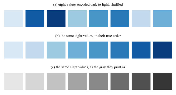
An ordered quantity therefore needs an ordered channel. If the reader must rank, compare or interpolate, the value has to move the marks from dark to light; if the reader must only tell one thing from another, a different color is exactly the right answer.
C.5.2 Color and grayscale are judged in context
The eye does not measure a color, it compares one. Every patch is reported relative to what surrounds it, so the same ink can be read as two different quantities in two places on the same page. Fig. C.9 is the demonstration, and it uses no color at all.
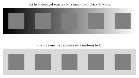
Gray is a poor default rather than a safe one (Fig. C.9).
A shade is only comparable to another shade on the same background.
C.5.3 Colormaps
Colormap
A colormap is a function from a scalar to a color, \(m:[0,1]\to (R,G,B)\), applied after the data has been normalized onto \([0,1]\).
What separates one colormap from another is how the gray level \(g\) of Sec. C.5.1 runs along the map, from one end to the other, and the requirement follows from what the map is being asked to encode. A sequential map has to get lighter throughout, because the reader must be able to rank any two values it produces. A diverging map has to turn exactly once, at the value its center is pinned to, which is what makes it read as a distance from that center. A map that turns anywhere else puts an edge on the page where the data has none. Fig. C.10 shows four maps against that requirement.
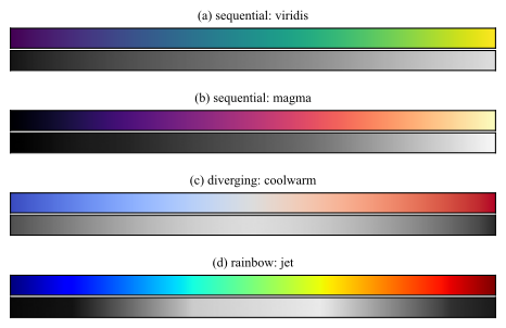
The gray rows are hard to compare bar against bar, so Fig. C.11 draws the same four gray levels as curves, one against the other.
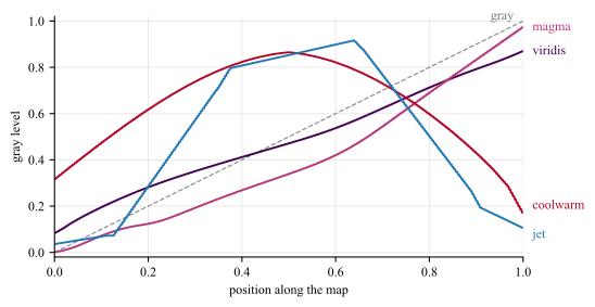
The rainbow colormaps, of which jet is the most common, fail this test outright. Fig. C.12 shows what the failure does to a field, by reducing each map to the gray it prints as.
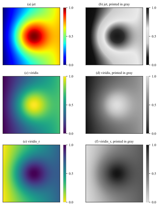
The dark blob in Fig. C.12(b) is at the maximum of the field. That inversion, and the bright ring the eye reads as a boundary, are artifacts of the colormap, not features of the data. A map such as viridis, magma or cividis avoids them by construction: it is built so that equal steps in the data look like equal steps to the reader, and so that it never stops getting lighter.
jet colormap Why, then, is it still everywhere? Almost never because anyone chose it.
-
• Was the MATLAB default until R2014b and the matplotlib default until version 2.0, so every script and every figure written before those releases is jet by omission, and copied code carries the choice forward without ever restating it.
-
• Instrument software keeps it alive on its own: spectrum analyzers, thermal cameras, Doppler ultrasound, and seismic and weather displays ship it, often with no setting to change it.
-
• When a field has trained its readers on a fixed color-to-meaning mapping, or a figure must sit beside an archive drawn the same way, changing the map breaks the comparison the figure exists to support.
-
• The three turns of Fig. C.11 put visible bands and edges on the image, and in color, at full brightness, that extra structure reads as detail rather than as damage; the author sees a sharp picture, and only the reader of the printed version sees Fig. C.12(b).
-
• Color also names a value well even though it ranks values badly. “The red region” is easy to say and easy to match against a colorbar, so reading one value off the figure feels accurate.
Inherited, not chosen
jet on a figure is almost always a default nobody revisited. Change it, unless the figure has to be read against an archive drawn the same way, and (optionaly) say so in the caption.
C.5.4 Schemes
Scheme
A scheme, or palette, is a short fixed list of colors chosen as a set, \(\{c_1,\dots ,c_k\}\).
Colormaps and schemes are convertible, which is why the words get swapped: sampling a colormap at \(k\) points produces a scheme, and interpolating between the entries of a scheme produces a colormap. The first direction is routine for the ordered families below, and is how most sequential schemes are obtained. The second is not, because interpolating between unordered categories produces colors that stand for nothing.
Choosing a scheme
-
• Sequential, one color running light to dark, for a quantity with a low end and a high end: counts, magnitudes, probabilities, densities. Its \(k\) colors are a sequential colormap cut into \(k\) classes.
-
• Diverging, two colors meeting at a neutral middle, for a quantity with a meaningful center: residuals and errors around zero, correlations, differences between two models. The middle must be pinned to the meaningful value, or the map asserts a center where none exists.
-
• Qualitative, different colors of similar darkness, for unordered categories: class labels, model names, cluster identities (Ch. ??). Six to eight is the practical ceiling; past that, the colors stop being distinguishable and direct labeling is the answer.
An excellent source of schemes is Cynthia Brewer’s picker at https://colorbrewer2.org, most of which ships with matplotlib under the same names.2
Fig. C.13 shows two schemes from each family with its gray beneath, which turns the choice from a matter of taste into a matter of shape.
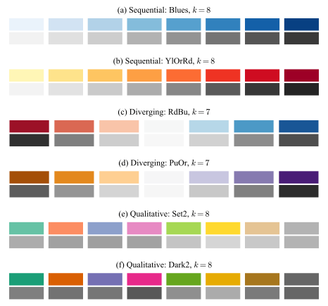
The gray rows also say what each family must not be used for. A sequential map has no center to put a zero on; a diverging map applied to a quantity with no meaningful center asserts one; and a qualitative map used for a magnitude leaves the reader nothing to rank with.
2 M. Harrower and C. A. Brewer, “ColorBrewer.org: An Online Tool for Selecting Colour Schemes for Maps”, The Cartographic Journal, vol. 40, no. 1, 2003, pp. 27–37. The tool also filters on colorblind-safe, print-safe and photocopy-safe, which is the check of Sec. C.5.5 applied before the figure exists rather than after.
C.5.5 Color deficiency
The deficiency is not one condition. Fig. C.14 passes the visible spectrum through each common form, and Table C.2 gives how frequent each one is.
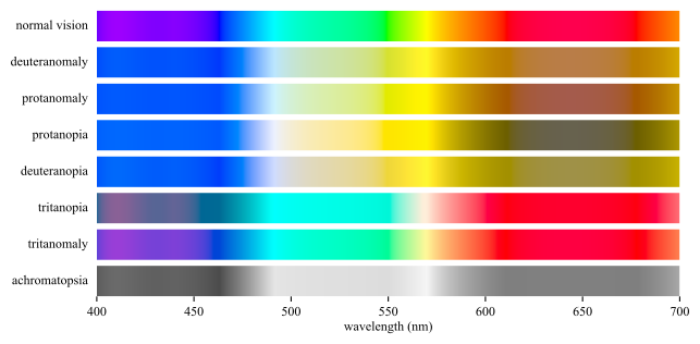
| Form | Men | Women | ||
| Deuteranomaly | 5 | % | 0 | .35% |
| Protanomaly | 1 | .3% | 0 | .02% |
| Protanopia | 1 | .3% | 0 | .02% |
| Deuteranopia | 1 | .2% | 0 | .01% |
| Tritanopia | 0 | .008% | 0 | .008% |
| Tritanomaly | 0 | .0001% | 0 | .0001% |
Red-green pair
Never let a red-green pair be the only thing separating two series.
Red-green deficiency affects roughly \(8\%\) of men of Northern European ancestry and \(0.4\%\) of women.
Fig. C.15 runs the same simulation on one chart drawn with two palettes.3 The data, the layout and the legend are identical in the two rows, so whatever separates them is the palette alone.
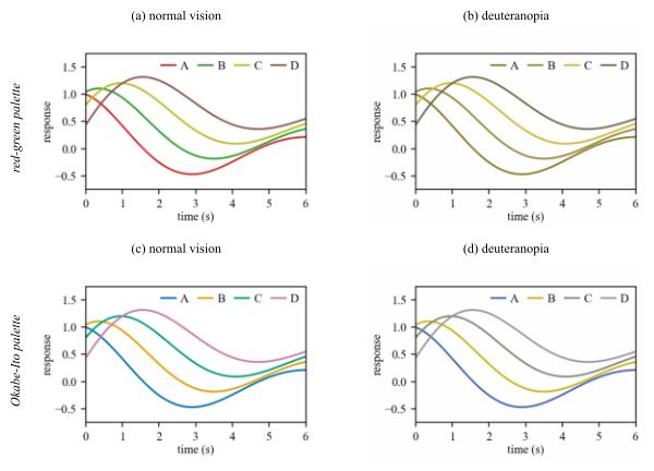
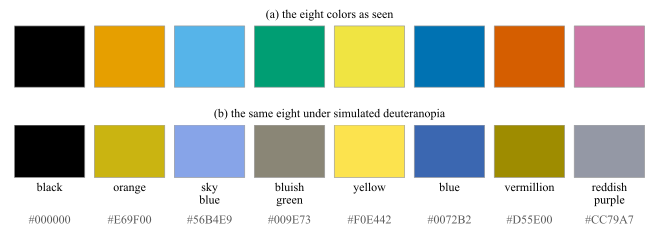
The palette of the lower row is not an invention of that figure. Fig. C.16 gives it in full: eight colors chosen so that no two of them merge under any common form of deficiency, published with a name and a code for each so that a figure can be specified in them.
3 Both figures simulate deficiency after Machado, Oliveira and Fernandes, “A Physiologically-based Model for Simulation of Color Vision Deficiency”, IEEE Trans. Visualization and Computer Graphics, vol. 15, no. 6, 2009, pp. 1291–1298. In Fig. C.15 it is applied to the rendered pixels of the chart, so the legend keys degrade exactly as the lines do. Fig. C.14 redraws “Color blindness” by SyntaxTerror, Public domain, via Wikimedia Commons, and Table C.2 follows the epidemiology table of Wikipedia contributors, “Color blindness”, Wikipedia, The Free Encyclopedia, revision of 11 August 2026, retrieved 18 August 2026.
Okabe-Ito
Eight colors that survive every common deficiency, in the order they are published: #000000, #E69F00, #56B4E9, #009E73, #F0E442, #0072B2, #D55E00, #CC79A7. Take them in that order and stop when the figure has enough; four of them are Fig. C.15(c).
A figure that survives both black and white print and vision deficiency simulation is legible to almost everyone.
Double encoding
Use double encoding whenever a distinction matters: give the series different:
-
• line styles or markers,
-
• colors.
C.5.6 Color Meaning
Social aspects
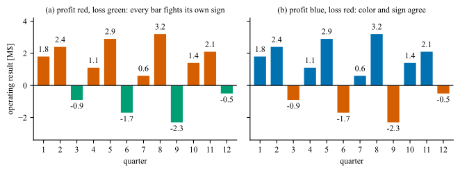
Finally, color carries meaning that the data may not intend. Red reads as loss, danger or failure and green as the opposite, and the reader applies that mapping before reading the axis. A figure that assigns the colors the other way is not merely unhelpful, it is asserting something about every mark on the page that the numbers contradict. Fig. C.17 puts one record through both assignments.
One strong color
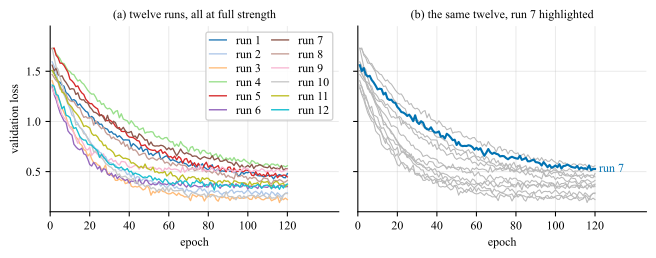
Strong color is a budget. Spend it on the one series, region or mark the text is about, draw everything else in gray at \(20\) to \(40\%\) ink, and let the reader find the subject pre-attentively, by the mechanism of Fig. C.5, without being told where to look. Fig. C.18 spends the budget both ways.
C.6 Choosing the Encoding
A chart maps numbers onto a visual channel, and the channels are not interchangeable. Their accuracy has been measured. The ranking is stable, and it is the most useful result in the field:
-
1. position along a common scale;
-
2. length;
-
3. slope and angle;
-
4. area;
-
5. volume;
-
6. shading and color strength;
-
7. a different color.
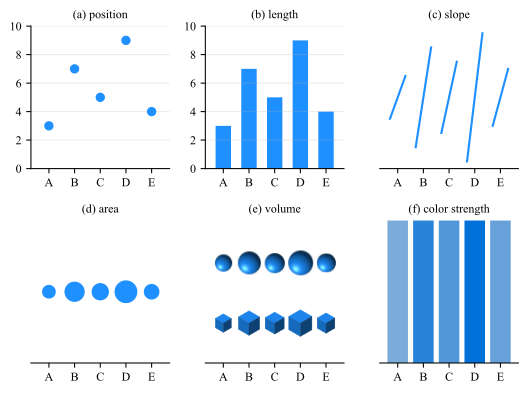
Fig. C.19 puts one set of five values through the first six of these channels, one panel per entry, from panel (a) for the first to panel (f) for the sixth, so the ranking can be felt rather than taken on trust. The seventh has no panel here because it has no answer: a set of colors is a set of names, and names do not come in an order, so the ranking cannot be recovered at all. Only the dark-to-light part of a color can be ranked, which is the subject of Sec. C.5.1.
Three consequences follow, and they account for most of the chart-type advice in circulation.
Bar, line and scatter
Bar, line and scatter are the workhorses. They occupy the top of the ranking. There is rarely a reason to reach past them for quantitative data.
C.6.1 Case Study: Pie and 3D plots
Pie charts encode angle and area Both sit low in the ranking, which is why comparing two slices of similar size is guesswork, and why a pie with more than three slices cannot be ordered by eye. The same numbers as a sorted bar chart are read exactly, in the same space.
Three dimensions on a flat page cost accuracy and buy nothing A 3D bar chart replaces length, which is second in the ranking, with volume under projection, which is fifth, and adds occlusion so that some bars hide others. Adding perspective makes it worse than guesswork: tilting the pie shrinks the back slices and enlarges the front ones, so the picture is no longer even a faithful rendering of the angles.
Both paragraphs above can be checked on one set of numbers. Fig. C.20 takes the five values \(37\), \(36\), \(24\), \(2\) and \(1\) through the four charts a spreadsheet offers for them. The two largest differ by one part in a hundred, and that difference is the test: every panel contains it, and one panel shows it.
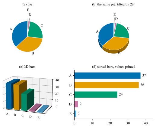
Panel (d) is not a more careful version of the others, it is a different encoding. It reads the values as length from a common baseline, second in the ranking, while (a) and (b) read them as angle and area, third and fourth, and (c) reads them as a height that has to be carried across a gap in depth before it meets a scale.
C.6.2 Case Study: Three variables on a flat page
Two variables get the two axes. A third has to go into a channel, and which channel is the whole question, because the ranking above is the answer to it. Fig. C.21 takes one record of forty training runs, each with a model size, a training set size and the accuracy it reached, and moves the training set size through four channels, one per panel. The reader is meant to take off the page that model size stops paying past about ten million parameters and training set size does not, so which of the two is worth the next budget.
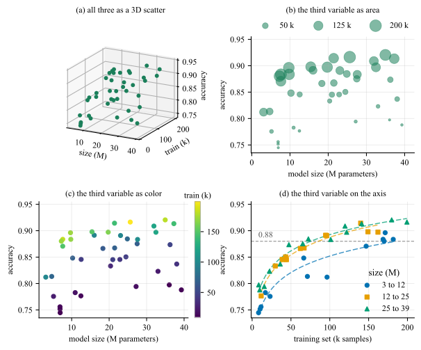
The four panels are four entries of the ranking, and they come out in its order.
-
• Panel (a) is not on the ranking at all: a projected point has no depth to decode, which is the argument of Sec. C.6.1 moved from a pie to a scatter.
-
• Panel (b) reads it as area, fourth.
-
• Panel (c) reads it as color strength, sixth, which supports more and less and stops there.
-
• Panel (d) reads the third variable as position on a common scale, first, which is why the number the question turns on is read off an axis instead of estimated.
Note (d) carries model size in two channels at once, color and marker shape.
C.6.3 Case Study: Radar charts
Radar chart
A radar chart, also called a spider or a web chart, places \(k\) categories at \(k\) equally spaced angles, draws each value as a radius along its own spoke, and joins the ends into a closed polygon. The angle is a slot rather than a quantity, which is what separates it from a polar plot: there the angle carries a direction, a phase or a time of day, and none of what follows applies.
The form has one honest use and it is narrow: a small number of profiles, measured on axes that genuinely share a scale, read for their shape rather than for their values. Every attribute is scored by the same panel on the same scale, so the radial axis means one thing on every spoke. Fig. C.22 takes one such record, four samples scored on six attributes, draws it in the form the chart usually takes, and measures beside it what that form does to the levels.
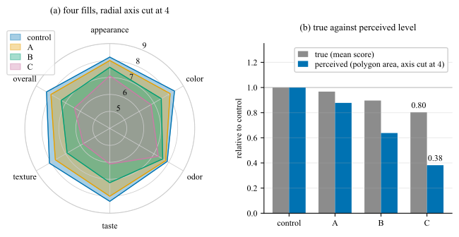
Panel (b) measures what panel (a) costs. The gray bar is what a sample scored, the blue bar is the level its polygon in panel (a) makes the reader perceive. The gap between the two is contributed by the encoding rather than by the data: nothing on panel (a) discloses that they differ. The gap widens with the drop, from \(0.09\) for sample A to \(0.42\) for sample C, so the chart is least trustworthy exactly where the finding is.
What panel (a) does wrong follows from what the polygon is. Its area on \(k\) equally spaced spokes with radii \(r_1,\dots ,r_k\) is
\(\seteqnumber{0}{}{1}\)\begin{equation} A_{\mathrm {poly}} = \frac {1}{2}\sin \!\left (\frac {2\pi }{k}\right )\sum _{i=1}^{k} r_i\,r_{i+1}, \qquad r_{k+1} = r_1 , \label {eq-plot-radar-area} \end{equation}
and two properties of that expression decide how the chart reads.
The area is quadratic in the values. The eye compares the filled shapes and not the radii. Sample C scores \(0.803\) of the control level and its polygon covers \(0.646\) of the control area, which overstates the drop by a factor of \(1.80\); that comparison is the pair of bars panel (b) draws. That is the exaggeration of a cut bar chart (Sec. C.7) in a form no axis label discloses.
The area depends on the order of the spokes. Eq. (C.2) pairs adjacent radii only, so permuting the axes changes it without changing a number. On this record the effect is small. The ordering is a choice the author makes and the reader cannot see.
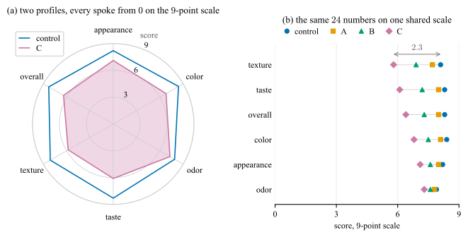
The fix for panel (a) is not a better radar chart. The same \(24\) numbers as a dot plot, one row per attribute and one marker per sample on a shared horizontal scale, drawn in Fig. C.23(b), put all of them at the top of the ranking of Sec. C.6: the largest difference in the record, \(2.3\) points of texture between the control and sample C, becomes a length rather than a shape. It also settles the comparison the radar chart cannot serve at all. Two attributes of one sample sit on one scale in a dot plot; on a radar chart they sit in two different directions.
If you draw one
Fig. C.23(a) is that box applied to the record of Fig. C.22, and panel (b) is the dot plot beside it. Panel (a) is as good as the form gets, and it is still the weaker of the two. Anchoring the radial axis at zero fixes the baseline and nothing else: by Eq. (C.2) the area stays quadratic in the scores, so sample C keeps \(0.803\) of the control level and \(0.646\) of the area, the same factor of \(1.80\) as before; the spoke order still moves the picture; and the finding of the record is a difference between two radii in (a) where panel (b) makes it a length on one scale.
Do not normalize the axes into agreement
Do not normalize the axes into agreement.
C.6.4 Case Study: Plot matrix
A relation is an \(n \times n\) table whose entry \((i,j)\) describes the pair rather than a single item: confusion matrices, correlation and distance matrices, and more. The default rendering for all of them is a colored grid, which encodes the value as shading, sixth in the ranking above.
Fig. C.24(a) is the grid as its script produced it, from the single line imshow(M, cmap=’viridis’, vmin=M.min(), vmax=M.max()). The map is stretched across the observed range, \(0.875\) to \(0.926\), so the entire excursion from deepest purple to full yellow is \(5.1\) points of accuracy, and no colorbar reports it.
Colorbar
A colormap fitted to the data range, with no colorbar to disclose it, is an error to fix.
Scaling
-
• vmin=M.min() is the cut baseline of Fig. C.27(a) moved into color: the scale is pinned to the data rather than to a meaningful zero, so every apparent difference is inflated by an amount the reader cannot detect. Subtract the reference before you color it!
-
• Switch the text color on the gray level of the cell rather than on the value.
-
• Do not re-encode the diagonal, which position already identifies; define every glyph, since an asterisk without a key is a legend without a key.
-
• The ordering rule of Sec. C.4.1.
The comparison the grid is being asked to support is between each transfer and the target channel’s own model, and there are two ways to make it: show that reference, or subtract it. Panels (b) and (c) show it. They keep the accuracies exactly as they were measured and mark each target’s own model beside them, so the shortfall is a distance on the page rather than a number the script arrived at, and the level of the results survives. That level is what ch \(3\)’s row is for: a model transferred into ch \(3\) is the least accurate destination of the four, \(0.8772\) against \(0.8928\) into ch \(2\).
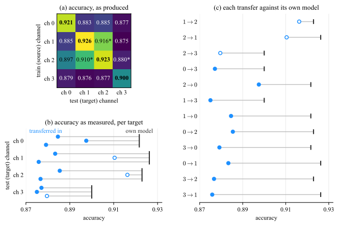
The two panels are not equally successful, and the reason is the reference. Panel (b) draws each of the four references once, so the levels are visible as levels and ch \(3\)’s rule at \(0.900\), against \(0.921\) to \(0.926\) for the others, is the finding. Panel (c) draws the same four references twelve times, in whatever order the sort produces; and by sorting on the segment it turns the shortfall into a length measured from twelve different starting points. Sort by a difference only when the marks that carry it start together, which is what a common zero gives and what the next figure draws.
Subtracting the reference is the other way. The quantity the argument turns on is then not the accuracy but the loss against that reference,
\(\seteqnumber{0}{}{2}\)\begin{equation} \Delta _{ij} = a_{jj} - a_{ij}, \label {eq-plot-matrix-gap} \end{equation}
where \(a_{ij}\) is the entry of the grid, the accuracy of a classifier trained on channel \(i\) and tested on channel \(j\): the row index \(i\) is the source the model was trained on, the column index \(j\) is the target it is tested on, and \(a_{jj}\) on the diagonal is the target’s own model, the reference every entry of column \(j\) is measured against. The loss is therefore zero on the diagonal by construction. Fig. C.25(a) draws the same numbers as \(\Delta \), anchored at zero. The row reading survives, the column reading inverts: column \(3\) is the darkest of Fig. C.24(a), yet its mean loss of \(0.0228\) is the smallest of the four. What is dark in that column is ch \(3\)’s own model, \(0.900\) against \(0.921\) to \(0.926\), reported by the raw matrix as though it were the effect. Ch \(3\) is at once the easiest target and the least accurate destination, and it takes both figures to say so: the loss alone cannot state a level, and the accuracies alone do not isolate the reference.
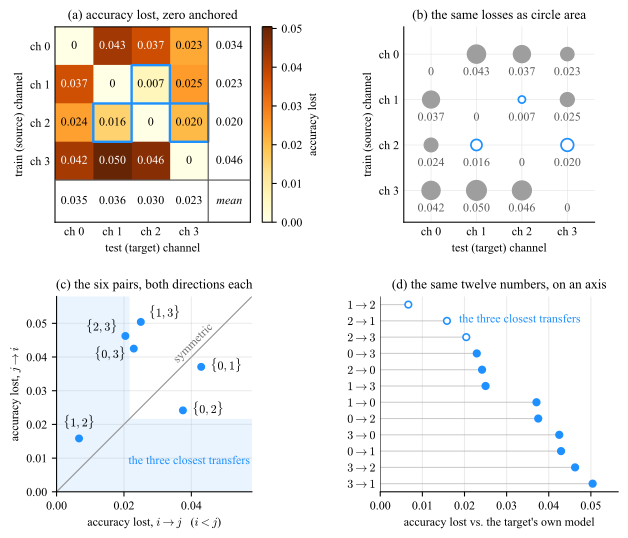
Panel (b) keeps the layout of (a) and changes the mark. The loss becomes the area of a circle, fourth in the ranking of Sec. C.6 where shading is sixth, and three things follow from that alone. No cell is judged against the shade of its neighbors, which is what Sec. C.5.2 says a filled grid cannot avoid. An exact zero draws nothing, so the diagonal empties itself rather than having to be blanked. And the panel needs no colorbar, because the value is printed under every mark, which is what a magnitude channel owes the reader in place of a key. What the area gives up is precision: the largest loss is \(7.6\) times the smallest, so its mark has \(7.6\) times the area and only \(2.7\) times the diameter, which is the length the eye compares.
Panels (c) and (d) put the same twelve losses at the top of the ranking, as position on a common scale. Panel (c) also answers what a grid invites and no reader performs, whether the relation is symmetric. It is not.
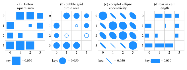
Circle area is not the only mark that frees a cell of its fill. Fig. C.26 keeps the layout and runs it through four of them. Only length can be ranked by eye.
Every magnitude channel needs a zero and a key
Shading, area and stroke width are all magnitude channels, and each needs a zero the scale is anchored to, and a key on the page stating what one unit of the mark is worth.
C.7 Axes
The axis is where a plot is most often quietly wrong, because the same choice is legitimate for one encoding and misleading for another.
C.7.1 The zero baseline
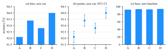
Whether an axis must include zero is decided by the encoding, not by convention. A bar encodes its value as a length measured from the baseline. A line encodes position, so cutting the axis rescales the whole picture uniformly and the reader can see the axis labels. Fig. C.27 is the bar case and Fig. C.28 the position case.
A cut bar chart is not a style choice
Panel (a) of Fig. C.27 is the most common misleading chart in circulation, and it is usually produced by accident: many libraries auto-scale the axis to the data range, so cutting the baseline is what happens when nothing is specified. Any bar chart whose baseline is not zero should be treated as an error to be fixed, not a decision to be defended.
If the differences are too small to see on a zero baseline and they matter, plot the differences themselves, with their confidence intervals, on a zero that means no difference.
The rule is about bars, and it does not run backwards: an axis that includes zero is not automatically the safer one. Fig. C.28 is the same argument from the other side, on a quantity whose marks encode position.
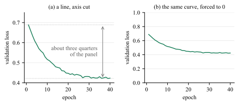
Forcing zero onto panel (b) does not make it honest, it deletes the finding: the plateau is left with is less than the separation at which a reader resolves anything at all. Nothing is gained in exchange, because no mark in the panel is a length measured from the baseline, so there is no length for the cut to distort.
How far to cut
A cut is a choice of limits, not just a decision to leave zero out. Choose them so that the data fill about two thirds to three quarters of the panel.
C.7.2 Cumulative totals
The baseline is not the only way a chart can be exactly right about its numbers and wrong about the question. A running total is monotone by construction: it cannot fall, whatever the process underneath it does, so it always draws a rising curve. Presented as evidence that an effort is working, it is evidence of nothing. Fig. C.29 plots one record both ways.
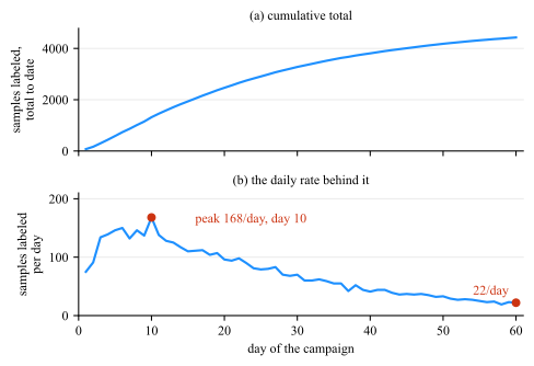
Plot the quantity the question is about!
C.7.3 Aspect ratio
The physical shape of the axes changes the slope a reader perceives, and slope is how a line chart is read. Fig. C.30 draws one series five times with identical axis limits: the first three change the height of the axes, and the last two repeat the third of them at two thirds and at a third of its width.
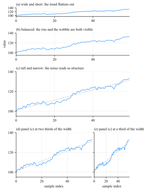
Ad hoc Cleveland’s rule of thumb is to bank to \(45^{\circ }\): choose the aspect ratio so that the typical line segment meets the horizontal near \(45^{\circ }\), since that is where a change in slope is easiest to detect.
C.7.4 Ticks and labels
Easy numbers
Ticks at \(1\), \(2\), \(5\), \(10\) and their mulitplications/powers, never at the \(7\) or \(13\) an algorithm sometimes lands on.
Labeled axes
Every axis names a quantity and a unit. A number without a unit is not a measurement.
Compress offset
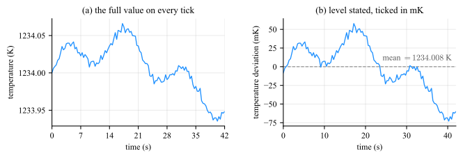
A quantity far from zero has its level stated on the panel and its deviation ticked in a unit sized to the drift. An offset parked in a corner box, or spelled out on every tick, both leave the reader doing arithmetic.
Fig. C.31(a) does what a reader normally asks for and puts the full value on every tick, and this record will not support it: six digits a label to report a drift of \(131\) mK, so the level is printed five times over, the quantity the figure is about is carried by the last two digits, and the ticks fall at \(7\) s. State the level on the panel, and tick the deviation from it in a unit sized to the drift, which is panel (b).
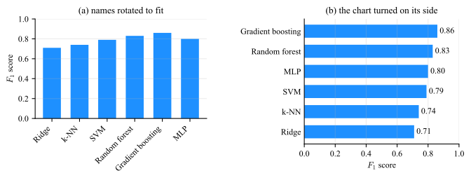
And treat rotated tick labels as a diagnostic rather than a solution: if the label names do not fit horizontally, the chart wants to be horizontal.
Rotating a label is not a style preference (Fig. C.32). The six names are the same in both panels and so are the six numbers; what changes is where the names are kept. Tilted under the axis they claim \(18.3\) mm of a \(66\) mm figure, which is \(28\%\) of its height taken out of the bars, and the reader still has to read them at an angle. Turned on their side they claim \(22.8\) mm of width, which comes out of the margin rather than the panel, and the same figure gives the bars \(47.2\) mm of height instead of \(37.6\).
C.7.5 Legends
A series has to be named somewhere, and there are only two approaches to put the name; the two differ in which of the two reading operations of Sec. C.4.1 the reader is made to perform.
-
• A boxed legend is a key set apart from the data, mapping a color or a line style to a name. Reading it is a table look-up, and it is a look-up per mark: the reader carries a color/style to the box, finds the matching key, carries the name back, and repeats it for the next series.
-
• An end-of-line label is the name set at the end of the series it belongs to, in that series’ color. There is nothing to carry anywhere, because the name is already where the reader is looking.
Fig. C.33 draws four curves both ways.
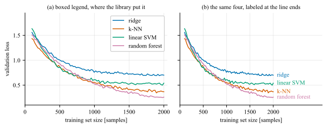
Three consequences, in the order they usually matter.
Label directly whenever there is room. It removes the look-up entirely.
Where a box is unavoidable, order it to match the page. Sort its entries to match the vertical order of the series at the edge where the reader meets them, and place it over a region carrying no data.
What the key is made of decides what the look-up costs. A key is read no faster than the channel it maps. Dash patterns and marker shapes are nominal: the entries have no order among them, so each is matched glyph by glyph, and the match is made again wherever the curves cross, which is exactly where the glyphs are hardest to tell apart. Line width and lightness are ordered: moved together they turn the key into a sequence, read once and then predicted, and its entries come out in the order the curves appear on the page, which is the previous rule obtained for nothing. Fig. C.34 is one record under both.
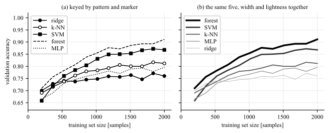
The one place redundancy is worth its ink
Encoding a quantity twice is normally waste (Sec. C.11), and panel (b) does it on purpose: the rank of a series is in its width and in its lightness at once.
With \(6+\) series, neither form works. End labels start to collide wherever the series converge, a box with a dozen keys is a second figure to read before the first one can be, and no ladder has a dozen separable steps either. That is the point at which the answer is small multiples (Sec. C.7.6) or highlighting one series against gray (Fig. C.18), not a smaller font.
C.7.6 Many plots at once
Legend won’t help. Stop drawing one plot and draw many: one panel per series, laid out as a grid, every panel on the same range. The grid is called small multiples. Fig. C.35 is the overlay beside its replacement.
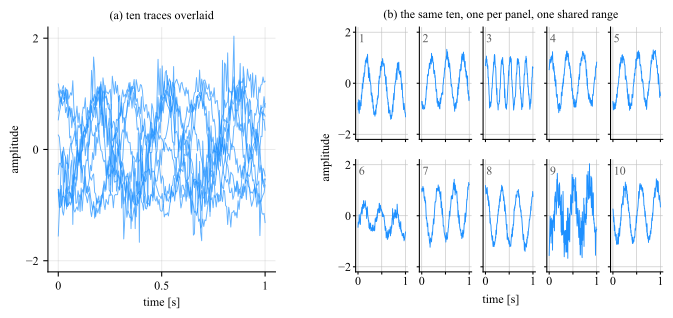
-
• One range, set once. Give the panels a single range on both axes and link them, so that the range is a property of the block rather than ten separate decisions. Per-panel autoscaling is the default in most libraries, and it produces ten plots that look like a comparison and are not one.
-
• Values on the outer edge only. The left column carries the \(y\) values and the bottom row the \(x\) values, and one label of each names the block. Ten copies of one axis is nine copies of ink, which is Sec. C.11 applied to a layout.
-
• Rule every panel, at the ticks it keeps. A panel stripped of its scale reports a shape and no quantity, exactly as a close-up does (Sec. C.7.7), and the separation still has to clear the limit of Sec. C.7.8 at the panel’s reduced size.
C.7.7 Close-ups
One axis range cannot always serve both the extent of a record and a feature inside it. A transient a few milliseconds wide, drawn across a panel that covers seconds, gets a fraction of a millimeter of the page whatever the aspect ratio, and no amount of care with the ticks recovers it. The answer is a second view at a second scale, and it comes in two forms.
-
• An inset: a small second axes drawn inside the panel, in a region that carries no data. It keeps the overview and the detail in one frame, and it costs nothing but the space it occupies.
-
• A broken-out panel: the same window as a full panel beside the overview. It is the answer when the parent has no free corner, when the zoom needs its own axis labels, or when the required magnification is large enough that a small inset would not resolve the feature anyway.
Fig. C.36 draws one record all three ways.
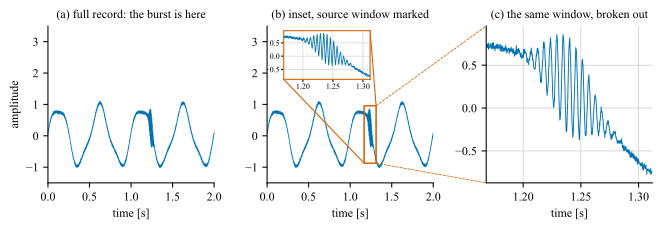
-
• Mark the source window with a rectangle on the parent panel, and connect the rectangle to the view it produced.
-
• Keep the ticks on the close-up, and rule it at them. A zoom without a scale shows a shape and reports no quantity, and the reader has no way to tell a \(10\)-fold magnification from a \(100\)-fold one. Ticks are the minimum; the grid at those ticks is what turns the magnified shape into values the reader can take off the page (Sec. C.7.8), and a close-up is read for values rather than for where the feature sits.
-
• Put the inset where there is no data. If the panel has no empty region, that is the signal to break the view out into its own panel rather than to cover the trace with it.
C.7.8 Size and gridlines
Two rules for the grid
-
• Rule the panel. The grid is the route from a mark to a number, and adding one improved accuracy at every size measured.
-
• Do not shrink a panel below the height at which its scale can be read.
-
• Do not rule it more finely than the reader can resolve.
-
• At a typical rendering of \(96\) pixels per inch that is a height of about \(2\) cm and a gridline separation of at least \(2\) mm, both measured on the printed page rather than on the screen the figure was authored on.
Both numbers are measured rather than chosen, and two results are what the measurement leaves for use.4
-
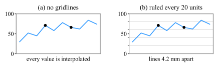
• On a \(0\) to \(100\) scale, gridlines every \(10\) or \(20\) units beat gridlines every \(50\) or \(100\).
-
• Not usefull once the lines fall closer together than the reader can separate them, which is about \(8\) pixels, or \(2\) mm at final size.
The default is often no grid at all, or a line every \(50\) units, and both leave the reader interpolating a value across half the panel. Fig. C.37 is that case beside its fix, at one panel size, so the ruling is the only thing that changes between the two.
4 Heer and Bostock, “Crowdsourcing Graphical Perception” (CHI, 2010), third experiment.
C.7.9 Logarithmic Axes
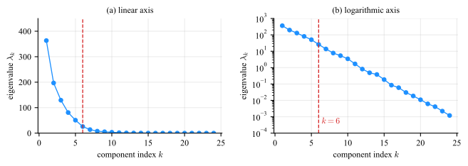
When a quantity spans several orders of magnitude, a linear axis shows the largest decade and compresses everything else onto the baseline (Fig. C.38).
No zero or negative values
A log axis cannot show zero or negative values, so a curve that reaches zero needs a different treatment
C.8 Choosing a Font
A figure’s text is document text. It is read on the same page, at the same distance, as the body around it.
-
• Text sized at the width the figure will actually be printed at.
-
• One font (at least family) throughout the figure, text and math.
C.8.1 Figure size sets the text size
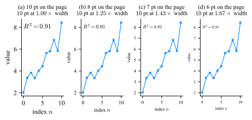
Point size is fixed in the script while the figure is scaled to fit the page, so the two are tied by one relation. A figure authored at width \(w_a\) and placed at width \(w_p\) has every glyph scaled by \(s = w_p / w_a\), and the size the reader actually gets is
\(\seteqnumber{0}{}{3}\)\begin{equation} p_{\mathrm {page}} = s\,p_{\mathrm {script}}. \label {eq-plot-fontscale} \end{equation}
Authored at \(15\) cm and placed at \(8.8\) cm gives \(s = 0.59\), so a \(10\) pt tick label arrives at \(5.9\) pt. Nothing in the script announces this, and nothing in the figure looks wrong until it is printed.
The reliable fix is \(s = 1\): set the figure width to the width it will occupy and place it without a width= override, so a point in the script is a point on the page. Fig. C.39 is drawn that way, which is what lets each of its panels be read twice over.
C.8.2 The three kinds of face
Three distinctions cover what a plotting library will offer, and only the last of them is a matter of mechanism rather than appearance.
-
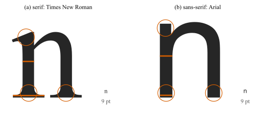
• Serif: small terminal strokes on the letters, the feet and heads magnified in Fig. C.40. It matches most printed body text, which makes it the default for a figure that will sit inside a document.
-
• Sans-serif: no terminal strokes, and a more even stroke weight. It survives small size, low resolution and a poor projector better, for the direct reason that the first detail to disappear in a serif face is the serif.
-
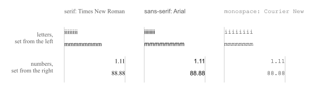
• Monospace: every character claims the same width, so an i occupies as much room as an m. That is the entire difference, and Fig. C.41 is it: eight i and eight m end at the same place in the monospace column and nowhere else.
The first two of the three differ in one detail, and it is a small one. At the size a label is actually read, a serif is a fraction of a millimeter of ink at the end of a stroke, which is why it takes a magnification to see what is being talked about, and why it is the first thing lost when the figure is shrunk or projected.
Monospace is worth reaching for when the text is something that was literally typed, since it preserves indentation and lets a reader count characters: code, file names, hex color codes such as the #1F77B4 of Sec. C.5.1.
Monospace is for programers
Monospace is commonly used for programing environments. Modern font families features a "texture healing" technique that softens the wide gaps usually found in fixed-width text, improving code readability while keeping a strict vertical grid.
Between serif and sans there is no reliable difference in reading speed to appeal to. That choice is settled by the medium and by the document the figure will sit in, not by preference.
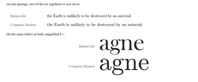
That is a statement about reading speed, and it is not a statement about everything else. Fig. C.42 is the case that makes the difference.
Two faces that look alike, and did not perform alike
In 2012 a newspaper ran a quiz that was really a typography experiment.5 Readers were shown one passage, arguing that the Earth is unlikely to be destroyed by an asteroid, and asked whether they agreed with it. What varied was the typeface: each reader was assigned one of six at random, among them Baskerville, Computer Modern, Georgia, Helvetica and Comic Sans. About \(45\,000\) answers came back.
Agreement ran about \(1.5\) percentage points higher in Baskerville than in the rest, significant at \(p < 0.01\) on that sample. Computer Modern was the runner-up and Comic Sans came last. The two at the top are the pair in Fig. C.42, and that is the finding worth carrying: they are two serif book faces that an ordinary reader cannot name, cannot tell apart in running text, and was not asked about. Whatever produced the difference, it was not anybody noticing the typeface.
What may not be concluded is that a typeface can be chosen for trust. It is one experiment, on one passage, with an effect of a percentage point and a half: large enough to measure at that sample size, and far too small to design around. What it does establish is that the face is never neutral, which is a reason to set it deliberately rather than to inherit it from the library.
5 Errol Morris, “Hear, All Ye People; Hearken, O Earth”, The New York Times, 2012, with the analysis by David Dunning and Benjamin Berman.
C.9 How a Reader Groups Marks
A reader does not perceive marks individually and then assemble them. Grouping happens first, automatically, and follows a set of regularities. Three of them do most of the work inside ordinary charts, and Fig. C.43 shows each doing it.
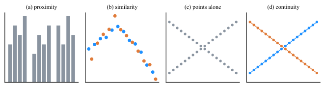
Each law is a tool and a hazard, because it applies whether or not the grouping it produces is real.
-
• Proximity groups by spacing. Deliberate use: widen the gap between categories that belong to different conditions, and the reader sees the conditions without a legend. Accidental use: uneven spacing produced by a default layout invents groups that are not in the data.
-
• Similarity groups by shared appearance. This is what makes a color legend work at all. It also means that two unrelated series drawn in similar colors will be read as one, and that reusing a color across panels asserts that the two things are the same thing.
-
• Continuity is asserted by a connecting line, and a line is a claim that the samples between the marks lie on the path drawn. That claim is true for a time series and false for measurements at unordered categories. Connecting points across a gap in the recording makes the same false claim; break the line at the gap instead.
-
• Closure lets a reader complete a shape from part of its outline, which is why a chart needs no box around it and no axis line on the side that carries no scale.
Similarity is more than alike or not alike. Where the series being grouped have an order of their own, the appearance that groups them can carry that order as well, as illustrated in Fig. C.44.

Shading a set of series
-
• If the series have an order, encode it: one ramp, monotone in lightness, and let dark stand for one end of it throughout the figure.
-
• If they have no order, use a qualitative scheme and do not imply one.
Either way the reader is meant to get the grouping and the ranking from the same channel, without consulting the key twice.
C.10 Transparency
Marks land on marks. In a dense scatter at full opacity the mark drawn last covers the ones drawn before it, so the panel reports the outline of the cloud and the accident of the draw order rather than what is inside it. Every library offers an opacity setting for exactly this problem: alpha in matplotlib, FaceAlpha and EdgeAlpha in MATLAB. A mark of color \(c\) drawn at opacity \(\alpha \) does not replace background color \(c_{\mathrm {bg}}\) that lies under it, it is mixed into it,
\(\seteqnumber{0}{}{4}\)\begin{equation} c_{\mathrm {out}} = \alpha \,c + (1-\alpha )\,c_{\mathrm {bg}} , \label {eq-plot-alpha-over} \end{equation}
so a second mark on the same spot mixes into the result of the first, a third into the result of the second, and after \(n\) of them the ink accumulated is
\(\seteqnumber{0}{}{5}\)\begin{equation} a_n = 1 - (1-\alpha )^n . \label {eq-plot-alpha-stack} \end{equation}
Two consequences follow from the same two lines, and they are the two halves of this section. Darkness now reports how many marks are there, which is what makes transparency work at all, and darkness now reports how many marks are there whether or not that is what the figure meant to say.
C.10.1 Misuse
Both failures in Fig. C.45 come from the same place: an opacity was set for the appearance of a single mark, and Eq. (C.5) was then applied to the places where the marks meet. Both fixes are the panel beside the failure, and they are the same fix: give the distinction to a channel that does not composite.
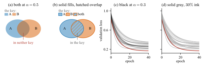
Two categorical colors must never overlap at \(\alpha \). Fig. C.45(a) is the failure: the intersection of a blue region and an orange one is a third color, present in the figure and in neither key, and by Eq. (C.5) which of the two possible mixtures it is depends on the order the two were drawn in. The legend is no help. The remedy is to keep the classes in channels that cannot mix. Fig. C.45(b) fills both classes solid, outlines each in its own key color so the shared area has a boundary of its own, and hatches that area in the other class color: both class colors reach the page exactly as the key shows them, the shared area is visible without being a third color, and it is a third entry in the key rather than something the reader has to decode. Separate panels, or a single hue where the darkness means only “more”, do the same job.
Transparency changes the color
By Eq. (C.5) the color on the page is not the color in the palette, and it changes again if the panel is later given a background: the same mark at \(\alpha = 0.5\) is one color over white and another over a gray panel. So the gray print and the color vision deficiency checks of Sec. C.5.5 have to be run on the rendered figure rather than on the palette it was specified from, and a colormap loses its perceptual uniformity as soon as an opacity is applied to it.
For de-emphasis, use a light solid color rather than \(\alpha \). Drawing the context series in black at low opacity, is not the same as drawing them light: the crossings accumulate by Eq. (C.6) and darken wherever the series happen to bunch. Fig. C.45(c) and (d) are the same twenty runs de-emphasized both ways, matched so that a lone curve renders identically in the two panels. The alpha panel grows a dark bar exactly where the runs converge, which competes with the highlighted curve for the attention the highlight was supposed to own, and which reports a bunching that no key on the page quantifies.
C.10.2 Accumulation
Used deliberately, the same accumulation is the point: a dense scatter stops being a silhouette and becomes a density display. That makes \(\alpha \) a magnitude channel, sixth in the ranking of Sec. C.6. It is also a channel that runs out, as Fig. C.46 shows.
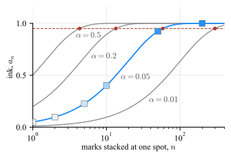
Set \(\alpha \) from the overlap, not by taste. Eq. (C.6) saturates, and quickly. Ink reaches \(95\%\) of full at \(n^{\ast } = \ln (0.05) / \ln (1-\alpha ) \approx 3/\alpha \), which is \(4.3\) marks at \(\alpha = 0.5\) and \(58.4\) at \(\alpha = 0.05\). Past that count the channel is exhausted and the picture is a silhouette again, which is why Fig. C.47(b) is barely an improvement on Fig. C.47(a). The working rule is
\(\seteqnumber{0}{}{6}\)\begin{equation} \alpha \approx \frac {1}{n_{\mathrm {typ}}} , \label {eq-plot-alpha-rule} \end{equation}
where \(n_{\mathrm {typ}}\) is the number of marks that typically share one marker footprint, which is a property of the data and the marker size and can be counted rather than guessed. It puts the typical spot at \(1 - e^{-1} = 0.63\) of full ink, in the middle of the channel with room above it for the crowded spots and below it for the sparse ones.
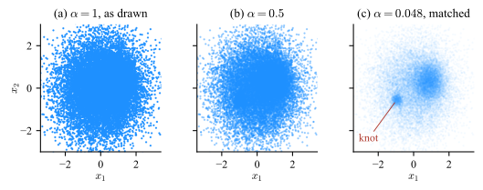
The same choice hides the isolated point. An \(\alpha \) small enough to resolve a crowd renders a lone mark at \(\alpha \) of full ink and nothing more, \(4.8\%\) in Fig. C.47(c), so the outlier that a scatter is often drawn to find is the first thing the setting removes. Where both matter, the two populations are two layers: the crowd at low \(\alpha \), and the points that are alone drawn separately at full strength.
Transparency is a magnitude channel without a key
A scatter at \(\alpha < 1\) encodes count as darkness, so it falls under the rule of Sec. C.6.4: every magnitude channel needs a zero and a key. It has neither, and Eq. (C.6) is not linear in the count either, so the darkness cannot be read back even in principle. Use it to reveal that structure exists, never to report how much of it there is.
PDF file size
A transparent mark forces a transparency group into the PDFT. The twenty thousand markers of each panel of Fig. C.47 make a \(0.9\) MB file that is slow to open and slower to print. Rasterizing the dense layer alone, keeps the axes and every label vector while the cloud becomes an image at the export resolution, and brings the same figure to \(205\) kB.
C.11 Ink That Carries No Data
Tufte’s data-ink ratio is the fraction of the ink on the page that encodes data. Everything else is either structure the reader needs, such as axis lines and tick labels, or decoration. Decoration is not neutral: it competes for the same attention the data needs, and the grouping laws of Sec. C.9 act on it just as readily.
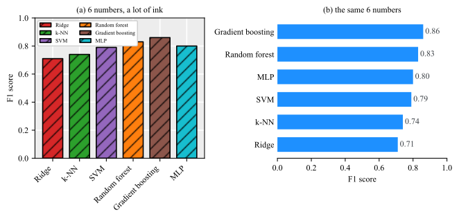
Panel (b) removes nothing that a reader uses.
C.12 Figures Inside a Document
A figure in a book or a paper is read on its own, out of order, before the surrounding text. Two requirements follow.
The figure must be self-contained Axes labeled with quantity and unit, series identified in the figure rather than in the body text, and any parameter the reader needs to interpret the panels stated in the caption. The test is whether a reader who has seen only this page can say what is plotted.
The caption states the finding, not the axes A caption reading “Accuracy versus training set size” repeats the axis labels and adds nothing. A caption reading “Accuracy saturates beyond \(2000\) samples, so the remaining error is not a data-quantity problem” tells the reader what the figure is for. The captions throughout this book are written this way, and the numbers they quote are printed by the scripts that draw the figures, so the two cannot drift apart.
Export so the figure survives the page The conventions of this book are a worked instance of everything above: figures are drawn at the width they will occupy, so Eq. (C.4) gives \(s = 1\) and the point sizes in the script are the point sizes on the page, and they are exported to PDF and SVG so they stay vector at any zoom, plus JPEG at \(300\) dpi where a raster is needed. LaTeX then includes them without an extension, so the same source produces the PDF and the HTML build.
Further Reading
-
• The best stats you’ve ever seen, TED, Feb. 2006.
-
• Wikipedia: Anscombe’s quartet and Anscombe, “Graphs in Statistical Analysis” (The American Statistician, 1973): four pages, and the origin of Fig. C.3. The argument that a regression should never be reported without the scatter it was fitted to.
-
• ColorBrewer, and Harrower and Brewer, “ColorBrewer.org” (The Cartographic Journal, 2003): the scheme families of Sec. C.5, with a picker that filters on colorblind-safe, print-safe and photocopy-safe.
-
• Wong, “Points of View: Color Blindness” (Nature Methods, 2011): two pages, and the source of the eight-color palette used in Fig. C.15. See also Machado, Oliveira and Fernandes (2009) for the simulation model behind that figure.
-
• “Color blindness” (Wikipedia): the conditions the second check of Sec. C.5.5 tests against — which types exist, how common each is, and which pairs of colors they merge.
Software
-
• matplotlib, plot types: one thumbnail and one call per chart type, grouped by the kind of data. The fastest way to answer the “which chart” question of Sec. C.6 without inventing something exotic.
-
• matplotlib, the gallery: the same catalog with complete runnable source for every figure, including the colormap comparisons of Sec. C.5 and the small-multiple layouts of Sec. C.7.6.
-
• MATLAB plot gallery: the MATLAB counterpart, organized the same way, for the figures produced by the scripts in matlab/.
-
• “Types of MATLAB Plots”: the same catalog inside the documentation, indexed by data type, with the function name for each.
-
• “Choosing colormaps in Matplotlib”: the sequential, diverging and qualitative families of Sec. C.5, with the gray level of each map plotted along it, which is the measurement behind Fig. C.11.
-
• ColorBrewer: interactive scheme selection with color-blind-safe and print-safe filters, originally built for cartography and applicable unchanged to any categorical or sequential encoding.
-
• colorcet: colormaps beyond the viridis family that are built to the same rule — equal steps in the data look like equal steps — including maps designed for cyclic quantities such as phase.
-
• matplotlib, hexbin: the display to fall back on when a scatter is too dense for any opacity setting: the count per cell in one call, with the colorbar that \(\alpha \) cannot carry and the log-count option that a heavy-tailed density needs.
-
• datashader: the same idea at the size where binning has to happen before the plot exists, tens of millions of points aggregated into the pixel grid of the figure rather than handed to the renderer as marks.
-
• matplotlib, radar chart: the polygon of Sec. C.6.3 built on a polar axes, with the category-to-spoke transform written out, for the cases where the form is the right one.
-
• matplotlib, Hinton diagram: the square-area matrix of Fig. C.26(a) in about twenty lines, including the sign handling that a signed weight matrix needs.
Methods
-
• Cleveland and McGill, “Graphical Perception: Theory, Experimentation, and Application to the Development of Graphical Methods” (J. American Statistical Association, 1984): the experiments that produced the encoding ranking of Sec. C.6, and the source of the banking-to-\(45^{\circ }\) rule.
-
• Heer and Bostock, “Crowdsourcing Graphical Perception” (CHI, 2010): the ranking replicated on a large sample, extended to rectangular area encodings and to chart sizes below the range Cleveland and McGill tested. Its third experiment is the chart-size and gridline-spacing study of Sec. C.7.8, whose recommendation is that gridlines be separated by at least \(8\) pixels and that chart height beyond \(80\) pixels buys little on a \(0\) to \(100\) scale.
-
• Behrisch, Bach, Henry Riche, Schreck and Fekete, “Matrix Reordering Methods for Table and Network Visualization (Computer Graphics Forum, vol. 35, no. 3, 2016): the sorting rule of Sec. C.4.1 applied to the rows and columns of the matrix of Sec. C.6.4, with a survey of the algorithms and guidance on which to use for a given size and structure.
-
• Krzywinski et al., “Circos: An Information Aesthetic for Comparative Genomics (Genome Research, vol. 19, no. 9, 2009, pp. 1639–1645): the chord diagram on the data it is the right answer for, a genuine flow between many entities rather than the four near-equal levels of the matrix of Sec. C.6.4.
-
• Porter and Duff, “Compositing Digital Images (SIGGRAPH, vol. 18, no. 3, 1984, pp. 253–259): the paper that introduced the alpha channel and the over operator of Eq. (C.5), whose repeated application is Eq. (C.6) and whose order dependence is Fig. C.45(a).
-
• Flannery, “The Relative Effectiveness of Some Common Graduated Point Symbols in the Presentation of Quantitative Data (The Canadian Cartographer, vol. 8, no. 2, 1971, pp. 96–109): why a circle whose area encodes a value is read slightly small, and the correction cartographers apply for it. The measurement behind the caution on Fig. C.26(b).
-
• Hinton, “Connectionist Learning Procedures (Artificial Intelligence, vol. 40, 1989, pp. 185–234): a survey from the period in which a weight matrix was routinely shown as a grid of scaled squares, the display that Fig. C.26(a) is named after.
-
• Tufte, The Visual Display of Quantitative Information (2nd ed., 2001): data-ink ratio, chart junk and the lie factor, which are Sec. C.11 and Sec. C.7 in their original form.
-
• Tufte, Visual Explanations (1997), Ch. 2: the Challenger analysis of Sec. C.2, reproducing the charts presented on the night and reconstructing what a temperature axis would have shown.
-
• Report of the Presidential Commission on the Space Shuttle Challenger Accident (1986): the primary source, including the O-ring damage record and the full set of charts of Fig. C.1.
-
• Dalal, Fowlkes and Hoadley, “Risk Analysis of the Space Shuttle: Pre-Challenger Prediction of Failure” (J. American Statistical Association, 1989): the same data treated as a logistic regression, with the failure probability at \(31\,^{\circ }\)F and an honest account of how much the extrapolation can support.
-
• Few, Show Me the Numbers (2nd ed., 2012): the pre-attentive feature list of Sec. C.4 and a practical treatment of tables, which most visualization books skip.
-
• Encyclopædia Britannica, “Information theory: Physiology”: the per-sense transmission rates of Table C.1 and the estimate of conscious throughput behind the compression argument of Sec. C.4.
-
• Wong, The Wall Street Journal Guide to Information Graphics (2010): one page per problem, in the before-and-after form of Fig. C.48.
-
• Borland and Taylor, “Rainbow Color Map (Still) Considered Harmful” (IEEE Computer Graphics and Applications, 2007): why jet produces the false boundaries of Fig. C.12, with examples from medical imaging where the artifacts were mistaken for findings.
-
• Crameri, Shephard and Heron, “The misuse of colour in science communication” (Nature Communications, 2020): a survey of colormap use across published work, with the perceptual-uniformity and color-blind-safety tests of Sec. C.5 applied at scale.
-
• Munzner, Visualization Analysis and Design (2014): the systematic treatment, organizing the whole field by what task the reader is performing and which channel serves it.
-
• NVIDIA, Georgia Institute of Technology and Prairie View A&M University, Accelerated Data Science Teaching Kit, Modules 7 and 8 (CC BY-NC 4.0): the course material this appendix was drafted from, covering the same ground as lecture slides with additional worked examples.
Bibliography
-
[1] Tomas Andersson. Selected topics in frequency estimation. PhD thesis, KTH Royal Institute of Technology, 2003.
-
[2] Dima Bykhovsky. Experimental lognormal modeling of harmonics power of switched-mode power supplies. Energies, 15(2), 2022.
-
[3] Dima Bykhovsky and Asaf Cohen. Electrical network frequency (ENF) maximum-likelihood estimation via a multitone harmonic model. IEEE Transactions on Information Forensics and Security, 8(5):744–753, 2013.
-
[4] Lorenzo Ciampiconi, Adam Elwood, Marco Leonardi, Ashraf Mohamed, and Alessandro Rozza. A survey and taxonomy of loss functions in machine learning. arXiv preprint arXiv:2301.05579, 2023.
-
[5] Angus Dempster, François Petitjean, and Geoffrey I Webb. Rocket: exceptionally fast and accurate time series classification using random convolutional kernels. Data Mining and Knowledge Discovery, 34(5):1454–1495, 2020.
-
[6] Angus Dempster, Daniel F Schmidt, and Geoffrey I Webb. Minirocket: A very fast (almost) deterministic transform for time series classification. In Proceedings of the 27th ACM SIGKDD conference on knowledge discovery & data mining, pages 248–257, 2021.
-
[7] Bo Diao, Kun Wen, Jian Chen, Yueping Liu, Zilin Yuan, Chao Han, Jiahui Chen, Yuxian Pan, Li Chen, Yunjie Dan, Jing Wang, Yongwen Chen, Guohong Deng, Hongwei Zhou, and Yuzhang Wu. Diagnosis of acute respiratory syndrome coronavirus 2 infection by detection of nucleocapsid protein. medRxiv, 2020.
-
[8] Sharon Gannot, Zheng-Hua Tan, Martin Haardt, Nancy F Chen, Hoi-To Wai, Ivan Tashev, Walter Kellermann, and Justin Dauwels. Data science education: The signal processing perspective [sp education]. IEEE Signal Processing Magazine, 40(7):89–93, 2023.
-
[9] Toni Giorgino. Computing and visualizing dynamic time warping alignments in r: the dtw package. Journal of statistical Software, 31:1–24, 2009.
-
[10] Monson H Hayes. Statistical Digital Signal Processing and Modeling. John Wiley & Sons, 1996.
-
[11] Kaiming He, Xiangyu Zhang, Shaoqing Ren, and Jian Sun. Delving deep into rectifiers: Surpassing human-level performance on imagenet classification. In Proceedings of the IEEE international conference on computer vision, pages 1026–1034, 2015.
-
[12] Steven M. Kay. Fundamentals of Statistical Signal Processing, Volume I: Estimation Theory. Prentice Hall, 1993.
-
[13] Nitish Shirish Keskar, Dheevatsa Mudigere, Jorge Nocedal, Mikhail Smelyanskiy, and Ping Tak Peter Tang. On large-batch training for deep learning: Generalization gap and sharp minima. arXiv preprint arXiv:1609.04836, 2017.
-
[14] Jason Lines, Sarah Taylor, and Anthony Bagnall. Hive-cote: The hierarchical vote collective of transformation-based ensembles for time series classification. In 2016 IEEE 16th international conference on data mining (ICDM), pages 1041–1046. IEEE, 2016.
-
[15] Boaz Porat. Digital processing of random signals: theory and methods. Courier Dover Publications, 2008.
-
[16] Pavel Senin and Sergey Malinchik. Sax-vsm: Interpretable time series classification using sax and vector space model. In 2013 IEEE 13th international conference on data mining, pages 1175–1180. IEEE, 2013.
-
[17] Albert Wong, Athena Nguyen, Eugene Li, Yew-Wei Lim, Mike Wu, and Shuk Wai Tsang. Combining classifiers for improved accuracies -voting and linearly weighted algorithms, Feb 2026.
-
[18] Lexiang Ye and Eamonn Keogh. Time series shapelets: a new primitive for data mining. In Proceedings of the 15th ACM SIGKDD international conference on Knowledge discovery and data mining, pages 947–956, 2009.